Excel and R
An intro to Excel and R, demonstrating something of the different ways of imagining working with data.
I might be making a terrible assumption, but I’m assuming that many if not most of you have played around with Excel before. What follows is a very basic introduction, just in case. If you really haven’t played with Excel at all, do have a look at this Gentle Introduction to Excel and Spreadsheets for Humanities People, by Heather Froehlich
Library and Archives Canada provides links to historical census data, along with quite comprehensive discussion about how the material was digitized, how it was collected in the first place, and the limitations of the data.
Unfortunately, none of it is available as a simple table that we could download. Indeed, if you go through that link and look, you’ll see just how much work would be involved in trying to digitize these things so that we could do quantitative work on it!
So for the purposes of becoming acquainted with Excel, let’s download some data from the Canadian 2016 Census - right-click and save-as this link: ‘Age (in Single Years) and Average Age (127) and Sex (3) for the Population of Canada, Provinces and Territories, Census Metropolitan Areas and Census Agglomerations, 2016 adn 2011 Censuses - 100% Data
Unzip that file; inside you’ll find the data files and files describing the data, which we call the ‘metadata’.
What we’re going to do is: filter this data for something of interest, and then make a chart from it.
Now, Excel is a very powerful tool. It also comes in several different flavours with slightly different layouts, which makes teaching excel extremely vexing. Most new PCs will have Excel on them; most new Macs will not. Do not worry if you don’t have a copy of Excel; Google Sheets also works in a very similar vein.
The key idea is that each cell in a spreadsheet has an address. Knowing the address for a range of cells, or just one cell in particular means that you can do calculations that update themselves as you change the data. For instance, if I had all of my student’s scores in say column A from a test (not that I assign tests), I could have a cell at the bottom of that column that has this formula: =average(a1:a23). Excel will tally up all of the cells from a1 to a23 (column a, row 1, to column a, row 23), and divide that sum by the count of cells, printing out an average. If I made a mistake on a student’s score, I could change it (by re-entering the score in say cell a13) and Excel will automatically adjust the average.
You can thus program pretty nearly any mathematical operation you want into a spreadsheet, remembering that cells don’t just hold values, they can also hold formulae.
Start Excel. Under ‘open’, find the csv that you downloaded. Excel should be able to import this csv without issue; older versions of Excel sometimes have an issue here, and so will need to turn on the Text Import Wizard, details here.
What a lovely table of data. Let’s filter it for just the results for the Ontario side of the Ottawa-Gatineau census metropolitan area.
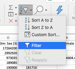 What the filter button looks like on my version of Excel
Every column now has a little drop-down arrow on it. Find column D, ‘GEO_NAME’ and press it:
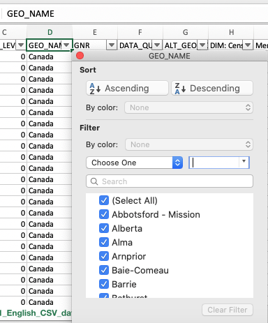 Uncheck ‘select all’ and scroll down through that until you see ‘Ottawa-Gatineau (Ontario Part)’
Boom! Your spreadsheet is now displaying 254 of 44196 records.
- Now, each row in this spreadsheet is an age category. We’re going to write a little formula to add up all of the female children 1 to 4 years of age. (This data starts in Row 15500!). Can you spot that data?
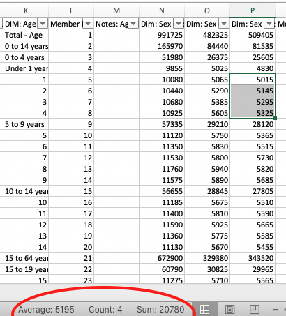
When you highlight cells, Excel automatically does a few calculations like averaging, counting, and summing them, which you can spot at the bottom.
In cell R15500, let’s write a little formula. We want to get the sum of female children 1 to 4 years of age. Our formula is going to look like this =sum() and between the parentheses will be the range. Put in the correct range, and hit enter. Did you get the right value? Have you selected the correct cells?
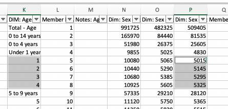
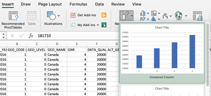
- Let’s make a chart. Using your mouse, click and drag down the Age column so that you select 1,2,3,4. Then, holding down the command key (mac) or ctrl (pc) click and drag again on the counts. You end up with two columns highlighted:
Then, click ‘insert’, then ‘recommended charts’ and pick one of the charts. Boom, instant chart. The first row we highlighted gives us our x value, the second our y; you can right-click on a chart to open up some interfaces for changing those assumptions, for adding labels, and so on.
When you save your work in Excel, an Excel file can contain numerous sheets, charts, interlinkages, and other quite complex objects. If you ‘save as’ and select ‘csv’, you’ll only get the data in the spreadsheet sheet currently active - plus a whole bunch of end-of-the-world warnings from Excel.
- Pivot Tables Pivot tables are a very useful feature of Excel; they are a way of summarizing quite complex tables and visualizing the summaries. But I won’t discuss them now. Instead, once you do the Topic Modeling Tool walk through, check out the final section in the official documentation on ‘Build a pivot table’ (here).
I’m not going to invest much time in Excel; but here’s some more guidance from Microsoft itself.
Some Basic Counting and Plotting in R
This is just a first taste of using R; much will seem opaque to you, but it will become more comfortable with time.
Start up your RStudio from Anaconda Navigator, and make a new R script. You might need to ‘install RStudio’ from the initial Anaconda Navigator interface first.
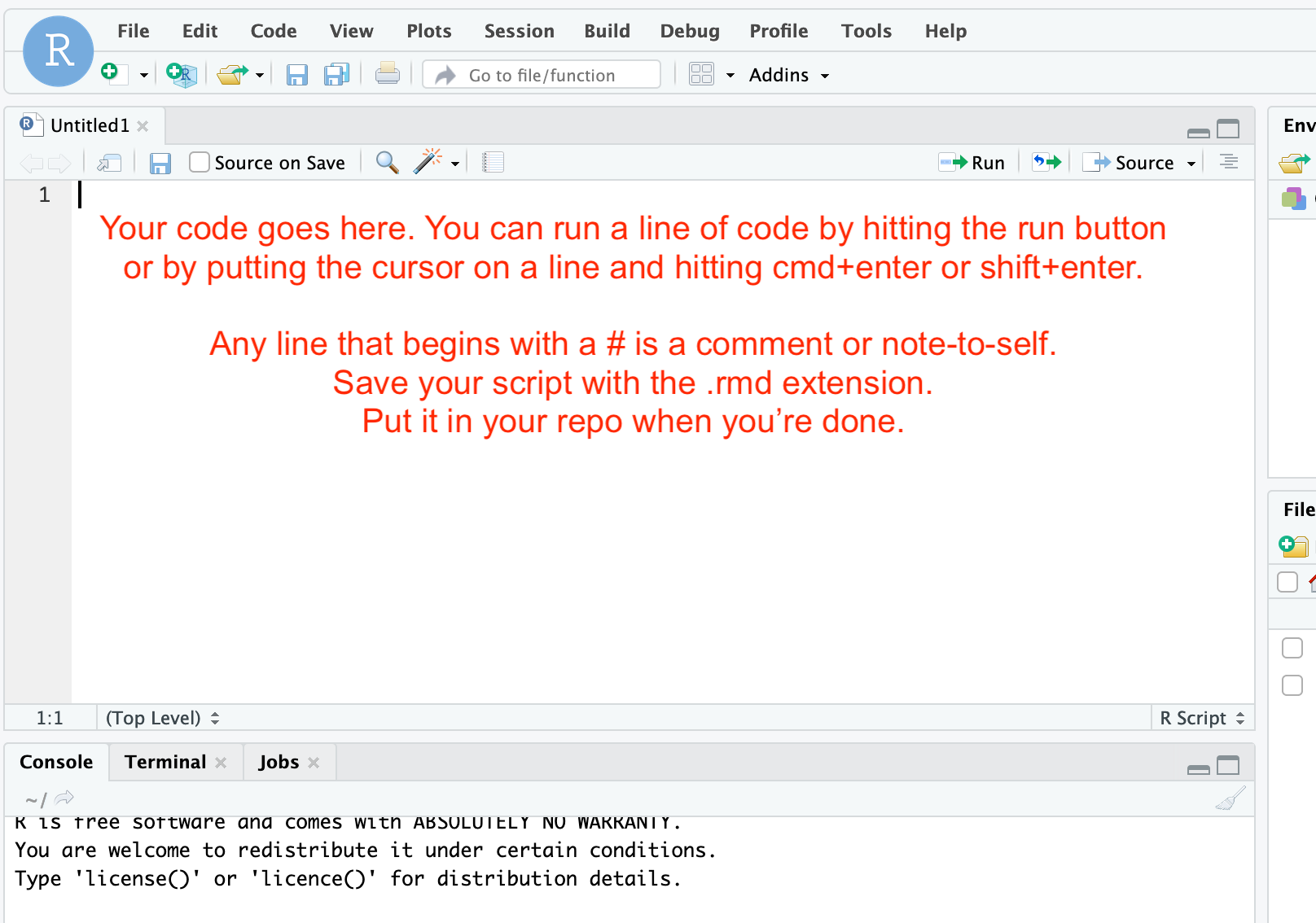
You will copy the code chunks below into the script window; then, you run the script one line at a time. The results will show up in the console window (the code will copy to the console; if everything runs correctly, the console will just show you anoterh > to indicate all is good. But if things aren’t good, the error messages will print in the console.)
The first thing we’re going to do is get set up so that we can import some data directly from the web. We use the RCurl package to do that (packages are like little bits of simpler code put together to do particular tasks; you can think of them as like specialized lego bricks):
install.packages("RCurl")
library("RCurl")
Put your cursor on the line you want to run, and then hit the run button for each line in turn. The first line, install.packages will go to the central R repository, find that package, and download it to your computer. You’ll see a lot of status messages file by in the console. Then, once that’s finished (the little ‘stop’ sign will disappear in your console window and the > prompt will reappear), do the next line. It will seem like nothing much has happened - the words library("RCurl") will appear in the console, and then the > prompt again. That’s how you know it worked. If it didn’t, you’d get an error message (and if you do get an error message, you can take a screenshot to show us in Discord and ask for help.).
When you install RCurl, you might see a ‘warning’ pop up in the console, saying that the package was built under an earlier version of R. That’s ok; most of the time, that won’t have an impact on us.
Now, we’re going to reach out onto the web and grab a table of historical data (a subsection of the colonial newspapers database created by Melodee Breals) and import it into R. We do that like this:
x <- getURL("https://raw.githubusercontent.com/shawngraham/exercise/gh-pages/CND.csv", .opts = list(ssl.verifypeer = FALSE))
See what happened there? We created a variable called x (could’ve called it newspapers or whatever you like) and told R to load the page url and deposit its results into that variable.
Windows users might get an error about the ‘getURL’ command. This command is part of the RCurl package, and plumbing the chain of dependencies to fix this is beyond us at the moment.
If that happens to you, you can use this workaround instead:
x <- "https://raw.githubusercontent.com/shawngraham/exercise/gh-pages/CND.csv"

documents <- read.csv(x)
Anytime there is data on the web that ends with .csv, you can load it into your work like this. (For instance, the Canadian Science and Technology museum makes a lot of its collections data available that way; a slightly edited copy of that is at the website for another course I teach, at https://dhmuse.netlify.app/data/cstmc-CSV-en.csv. You could try loading that data in if you’re ambitious. )
Notice you now have a variable in your ‘Global Environment’ pane called ‘X’. If you just type x in the console, after a few moments, it will print out everything that is inside that variable. If you scroll back to the top of that, you’ll see:
[1] "Article ID,Newspaper Title,Newspaper City,Newspaper Province,Newspaper Country,Year,Month,Day,Article Type,Text,Keywords\n ID1,Caledonian Mercury,Edinburgh,Scotland,United Kingdom,1811,08,26,inform,Commerce of Canada.Extract of a letter. The population of Canada in 1760 was reckoned at 62000 souls ...
Those first items are the headers for each of the columns. So we want to create a new table where each row is a unique document from X and each column has the proper headers. That will look like this:
documents <- read.csv(text = x, col.names=c("Article_ID", "Newspaper Title", "Newspaper City", "Newspaper Province", "Newspaper Country", "Year", "Month", "Day", "Article Type", "Text", "Keywords"), colClasses=rep("character", 3), sep=",", quote="")
We read the csv file from x, and create the columns into which the data is poured; all of this is now in documents. If you now typed View(documents) into the console you’ll see a nicely formatted table. When we only want to examine information from a particular column, we modify the variable slightly (eg. head(documents$Keywords) would return the first few rows - the head - of the information in the keywords column).
Now we can do some things. Let’s count the number of documents by the city in which they were published:
counts <- table(documents$Newspaper.City)
counts
The first counts creates the variable and looks at the column Newspaper.City inside the table documents; the second counts on its own reveals what’s inside the variable (and prints it to the console; you could also View(counts)). If you wanted to save this variable, this result, to file, you can use the write.csv command: write.csv(counts, "counts.csv"). And if you don’t know where exactly you’re saving, getwd() will tell you the exact location you’re working in.
Now let’s plot these counts:
barplot(counts, main="Cities", xlab="Number of Articles")
The plot will appear in the bottom right pane of RStudio. You can click on ‘zoom’ to see the plot in a popup window. You can also export it as a PNG or PDF file. Clearly, we’re getting an Edinburgh/Glasgow perspective on things. And somewhere in our data, there’s a mispelled ‘Edinbugh’. Do you see any other error(s) in the plot? How would you correct it(them)?
Let’s do the same thing for year, and count the number of articles per year in this corpus:
years <- table(documents$Year)
barplot(years, main="Publication Year", xlab="Year", ylab="Number of Articles")
There’s a lot of material in 1789, another peak around 1819, againg in the late 1830s. We can ask ourselves now: is this an artefact of the data, or of our collection methods? This would be a question a reviewer would want answers to. Let’s assume for now that these two plots are ‘true’ — that, for whatever reasons, only Edinburgh and Glasgow were concerned with these colonial reports, and that they were particularly interested during those three periods. This is already an interesting question that we as historians would want to explore.
Try making some more visualizations like this of other aspects of the data. What other patterns do you see that are worth investigating?
This page shows you the code for some other basic visualizations. See if you can make some more visualizations.
GUI vs Scripts
Notice any differences between trying to describe how to visualizations are created in Excel versus R? Which approach would be more intelligible in the context of say an academic article?