Network Analysis with Gephi
When you have historical actors in some kind of relationship, a network analysis and possibly visualization might be a useful approach.
Recall that the index of the collected letters of the Republic of Texas was just a list of letters from so-and-so to so-and-so. We haven’t looked at the content of those letters, but the shape of network — the meta data of that correspondence — can be revealing (remember Paul Revere!) When we stitch that together into a network of people connected because they exchanged letters, we end up with a shard of their social network. Networks can be queried for things like power, position, and role, and so used judiciously, we can begin to suss something of the social structures in which their history took place. I would recommend that you also take a long look at Scott Weingart’s series, Networks Demystified.
When Not To Use Networks
Networks analysis can be a powerful method for engaging with a historical dataset but it is often not the most appropriate. Any historical database may be represented as a network with enough contriving but few should be. One could take the Atlantic trade network, including cities, ships, relevant governments and corporations, and connect them all together in a giant multipartite network. It would be extremely difficult to derive any meaning from this network, especially using traditional network analysis methodologies. Clustering coefficients (a useful network metric), for example, would be meaningless in this situation, as it would be impossible for the neighbors of any one node to be neighbors with one another. Network scientists have developed algorithms for multimodal networks, but they are often created for fairly specific purposes, and one should be very careful before applying them to a different dataset and using that analysis to explore a historiographical question.
Networks, as they are commonly encoded, also suffer from a profound lack of nuance. It is all well to say that, because Henry Oldenburg corresponded with both Gottfried Leibniz and John Milton, he was the short connection between the two men. However, the encoded network holds no information of whether Oldenburg actually transferred information between the two or whether that connection was at all meaningful. In a flight network, Las Vegas and Atlanta might both have very high betweenness centrality because people from many other cities fly to or from those airports, and yet one is much more of a hub than the other. This is because, largely, people tend to fly directly back and forth from Las Vegas, rather than through it, whereas people tend to fly through Atlanta from one city to another. This is the type of information that network analysis, as it is currently used, is not well equipped to handle. Whether this shortcoming affects a historical inquiry depends primarily on the inquiry itself.
When deciding whether to use networks to explore a historiographical question, the first question should be: to what extent is connectivity specifically important to this research project? The next should be: can any of the network analyses my collaborators or I know how to employ be specifically useful in the research project? If either answer is negative, another approach is probably warranted.
Databasic.io
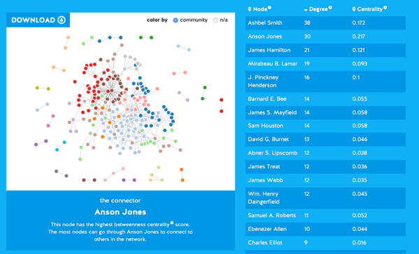
At Databasic.io there are simple web-tools to help you see some large-scale patterns in your information. Let’s use Connect the Dots which is a simple network visualizer and analyzer - it will find communities of nodes (dots; people, in our data) and it will give us two network metrics for each node - the degree (number of connections it has) and the centrality (here, imagined as being a person who is on lots of paths connecting all other pairs).
- Go to Connect the Dots and upload your Texas Correspondence file. Make sure it has a first row with
source,targetand that there are no spaces on either side of that comma, eg:
source,target
Sam Houston,J. Pinckney Henderson
James Webb,Alc6e La Branche
- Boom! A network visualization! What do you observe?
New tool If you don’t have a particularly large dataset, give Network Navigator a try; this tool also has some interesting visualization options that often capture very nearly everything you need.
More complex visualizatons and analysis
Connect the dots is pretty basic. If you want to do more complex network visualizations and analysis, you can try Gephi:
- Download and install Gephi.
- Open Gephi by double-clicking its icon.
- Click “New project”. The middle pane of the interface window is the “Data Laboratory,” where you can interact with your network data in spreadsheet format. This is where we can import the data cleaned up in Open Refine.
- In the Data Laboratory, select “Import Spreadsheet.”
- Press the ellipsis
...and locate the CSV you created. Make sure that the Separator is listed asCommaand theAs tableis listed asEdges table. - Press
NextthenFinish. Your data should load up. - Click on the “Overview” tab and you will be presented with a tangled network graph.
Navigating Gephi
Gephi is broken up into three panes: Overview, Data Laboratory, and Preview.
- The Overview pane is used to manipulate the visual properties of the network: change colors of nodes or edges, lay them out in different ways, and so forth. The Overview pane is also where you can apply algorithms to the network, like those you learned about in the previous chapter.
- The Data Laboratory is for adding, manipulating, and removing data.
- Use the Preview pane to do some final tweaks on the look and feel of the network and to export an image for publication.
There is one tweak that needs to done in the Data Table before the dataset is fully ready to be explored in Gephi.
Click on the Data Laboratory tab.
Click on the “Nodes” tab in the Data Table (this should be open already) and notice that, of the three columns, “Label” (the furthermost field on the right) is blank in every row. This will be a problem when viewing the network visualization, as those labels are essential for the network to be meaningful.
In the “Nodes” tab, click “Copy data to other column” at the bottom, select “ID”, and press “Ok”. Upon doing so, the “Label” column will be filled with the appropriate labels for each correspondent.
While you’re still in the Data Laboratory, look in the “Edges” tab and notice there is a “Weight” column. Gephi automatically counted every time a letter was sent from correspondent A to correspondent B and summed up all the occurrences, resulting in the “Weight.” This means that J. Pinckney Henderson sent three letters to James Webb, because Henderson is in the “Source” column, Webb in the “Target”, and the “Weight” is three.
Clicking on the Overview pane will take you to a visual representation of the network you just imported. In the middle of the screen, you will see your network in the “Graph” tab. The “Context” tab, at the top right, will show that you imported 234 nodes and 394 edges. At first, all the nodes will be randomly strewn across the screen and make little visual sense.
Fix the nodes by selecting a layout in the “Layout” tab – the best one for beginners is “Force Atlas 2.”
Press the “Run” button and watch the nodes and edges reorganize on the screen into something slightly more manageable. After the layout runs for a few minutes, re-press the button (now labeled “Stop”) to settle the nodes in their place.
You just ran a force-directed layout. Each dot is a correspondent in the network, and lines between dots represent letters sent between individuals. Thicker lines represent more letters, and arrows represent the direction the letters were sent, such that there may be up to two lines connecting any two correspondents (one for each direction).
About two-dozen smaller components of the network will appear to shoot off into the distance, unconnected from the large, connected component in the middle. For the purpose of this exercise, we are not interested in those disconnected components, so the next step will be to filter them out of the network.
The first step is to calculate which components of the network are connected to which others; do this by clicking “Run” next to the text that says “Connected Components” in the “Statistics” tab on the right side.
Once there, select “UnDirected” and press “OK.”
Press “Close” when the report pops up indicating that the algorithm has finished running. Now that this is done, Gephi knows which is the giant connected component and has labeled that component “0”.
To filter out everything but the giant component, click on the “Filters” tab on the right side and browse to “Component ID Integer (Node)” in the folder directory (you’ll find it under “Attributes,” then “Equal”).
Double-click “Component ID Integer (Node)” and click the “Filter” button at the bottom. Doing this removes the disconnected bundles of nodes.
There are many possible algorithms you could use for the analysis step, but in this case you will use the PageRank of each node in the network. This measurement calculates the prestige of a correspondent according to how often others write to him or her. The process is circular, such that correspondents with high prestige will confer their prestige on those they write to, who in turn pass their prestige along to their own correspondents. For the moment let us take its results to equate with a correspondent’s importance in the Republic of Texas letter network.
Calculate the PageRank by clicking on the “Run” button next to “PageRank” in the “Statistics” tab. You will be presented with a prompt asking for a few parameters; make sure “Directed” network is selected and that the algorithm is taking edge weight into account (by selecting “Use edge weight”). Leave all other parameters at their default.
Press “OK”.
Once PageRank is calculated, if you click back into the “Data Laboratory” and select the “Nodes” list in the Data Table, you can see that a new “PageRank” column has been added, with values for every node. The higher the PageRank, the more central a correspondent is in the network.
Going back to the Overview pane, you can visualize this centrality by changing the size of each correspondent’s node based on its PageRank. Do this in the “Ranking” tab on the left side of the Overview pane.
Make sure “Nodes” is selected, press the icon of a little red diamond, and select PageRank from the drop-down menu.
In the parameter options just below, enter the “Min size” as 1 and the “Max size” as 10.
Press “Apply,” and watch the nodes resize based on their PageRank.
To be on the safe side and decrease clutter, re-run the “Force Atlas 2” layout as described above, making sure to keep the “Prevent Overlap” box checked.
At this point, the network is processed enough to visualize in the Preview pane, to finally begin making sense of the data.
In Preview, on the left side, select “Show Labels,” “Proportional Size,” “Rescale Weight,” and deselect “Curved” edges.
Press “Refresh.”
Phew. Save your work. Gephi saves as .gephi file, but you can also export to other common formats like .gexf
So what?
So what have we got?
The visualization immediately reveals apparent structure: central figures on the top (Ashbel Smith and Anson Jones) and bottom (Mirabeau B. Lamar, James Webb, and James Treat), and two central figures who connect the two split communities (James Hamilton and James S. Mayfield). A quick search online shows the top network to be associated with the last president of the Republic of Texas, Anson Jones; whereas the bottom network largely revolves around the second president, Mirabeau Lamar. Experts on this period in history could use this analysis to understand the structure of communities building to the annexation of Texas or they could ask meta-questions about the nature of the data themselves. For example, why is Sam Houston, the first and third president of the Republic of Texas, barely visible in this network?